EuroBioC2025 OSTA Workshop
Source:vignettes/seq-workflow-visium-hd-cell.Rmd
seq-workflow-visium-hd-cell.RmdWorkflow: Visium HD cell-level
Authors: Yixing E. Dong1, Ellis Patrick2.
Last modified: 20 January, 2026.
Preparation
Dataset
The relevant data by Oliveira et al. (2025) are stored on Open Science Framework, and can be downloaded as delayed format cached on your laptop through OSTA.data:
library(OSTA.data)
id <- "VisiumHD_HumanColon_Oliveira"
pa <- OSTA.data_load(id)
dir.create(td <- tempfile())
unzip(pa, exdir=td)
list.files(file.path(td, "segmented_outputs"))
#> [1] "cell_segmentations.geojson"      "filtered_feature_cell_matrix.h5"
#> [3] "nucleus_segmentations.geojson"   "spatial"
We prepared a reader for Visium HD segmented output at
./vignettes/utils.R.
Update (January 2026): Pull requests branched from
this reader have been merged into the VisiumIO and
SpatialFeatureExperiment packages.
R / Bioconductor packages used
Bioconductor: Biobase, BiocStyle, Banksy, CARDspa, DropletUtils, GenomeInfoDb, ggspavis, OSTA.data, S4Vectors, scater, scran, scuttle, SingleCellExperiment, spacexr, SpatialExperiment, SpatialFeatureExperiment, spicyR, SpotSweeper, Statial, Voyager
CRAN: dplyr, ggplot2, grDevices, grid, here, igraph, magick, pals, patchwork, pheatmap, plotly, rlang, sf, tidyr, tidySpatialExperiment, tidyverse
Workshop goals and objectives
The key steps of Visium HD data analysis are described in this workshop, along with diverse visualizations of the methods used. The goal is to help beginner bioinformaticians working with Visium HD data become familiar with each step involved and complete a standard analysis pipeline from start to finish.
Learning goals
- Learn how to analyze Visium HD data with cell segmentation output
- Understand the key steps and methods for deriving biological insights
- Create aesthetic visualizations of Visium HD data using existing R packages
Learning objectives
- Read Visium HD segmentation output data as a
SpatialFeatureExperimentobject - Understand spatially aware quality control metrics
- Perform label transfer from single-cell reference data to spatial data
- Identify spatial domains and marker genes for each region
- Visualize Visium HD data as polygons or cell centroids
- Extract morphological metrics from cell polygons and make inference
- Conduct spatial analysis in a tissue slice
Introduction
As of June 2025, Visium HD enables direct output of H&E-segmented
cell-level data from SpaceRanger
v4. This automation removes the need for an additional segmentation
tool, such as bin2cell. Since biologists often find
cellular units more intuitive for deriving insights, this output may
attract more interest than bin-level data. However, bins outside cell
boundaries can still provide valuable information for many research
topics in the tumor microenvironment. In this workflow, we will
demonstrate several cell-level analysis steps using the same dataset,
subsetted to the same region, as in the Sequencing-based platforms -
Workflow: Visium HD bin-level chapter of the OSTA book.
Dependencies
library(AUCell)
library(Biobase)
library(BiocStyle)
library(Banksy)
library(CARDspa)
library(dplyr)
library(DropletUtils)
library(GenomeInfoDb)
library(ggfortify)
library(ggplot2)
library(ggpubr)
library(ggrepel)
library(grDevices)
library(grid)
library(here)
library(igraph)
library(magick)
library(msigdbr)
library(OSTA.data)
library(pals)
library(patchwork)
library(pheatmap)
library(plotly)
library(rlang)
library(S4Vectors)
library(scater)
library(scran)
library(scuttle)
library(sf)
library(SingleCellExperiment)
library(sosta)
library(spacexr)
library(SpatialExperiment)
library(spatialFDA)
library(SpatialFeatureExperiment)
library(spatstat)
library(spicyR)
library(SpotSweeper)
library(Statial)
library(stats)
library(tidyr)
library(tidySpatialExperiment)
library(tidyverse)
library(Voyager)
We source the reader defined in utils.R and specify
alias for plotting themes.
source(here::here("vignettes/utils.R"))

# ggplot theme alias
center_title <- theme(plot.title = element_text(hjust = 0.5))

no_legend <- theme(legend.position = "none")

gradient_theme <- theme(plot.title = element_text(hjust = 0.5),
                        legend.title = element_blank(),
                        legend.key.width = grid::unit(0.5, "lines"),
                        legend.key.height = grid::unit(1, "lines"))

thin_discrete_legend <- theme(legend.key.size = grid::unit(0.5, "lines"))

enlarge_legend_dot <- guides(col=guide_legend(override.aes=list(size=3)))

common_args_heatmap <- list(cellwidth=10, cellheight=10,
                            treeheight_row=5, treeheight_col=5)
Load spatial data
Output files from SpaceRanger v4 are located in
/segmented_outputs folder, following the expected structure
described in the Background - Importing data chapter of the
OSTA book.
id <- "VisiumHD_HumanColon_Oliveira"
pa <- OSTA.data_load(id)
dir.create(td <- tempfile())
unzip(pa, exdir=td)
We read the Visium HD cell-segmented data into a
SpatialFeatureExperiment object.
vhdsfe <- readVisiumHDCellSeg(td, res = "hires")
#> Reading layer `cell_segmentations' from data source
#>   `/tmp/RtmpoiuzOa/file8967cdcc18/segmented_outputs/cell_segmentations.geojson'
#>   using driver `GeoJSON'
#> Simple feature collection with 220704 features and 1 field
#> Geometry type: POLYGON
#> Dimension:     XY
#> Bounding box:  xmin: 40587.5 ymin: -28.8 xmax: 65202.7 ymax: 22701
#> Geodetic CRS:  WGS 84
vhdsfe
#> # A SpatialExperiment-tibble abstraction: 220,703 × 8
#> # Features = 18132 | Cells = 220703 | Assays = counts
#>    .cell Sample              Barcode sample_id pxl_col_in_hires pxl_row_in_hires
#>    <chr> <chr>               <chr>   <chr>                <dbl>            <dbl>
#>  1 3     /tmp/RtmpoiuzOa/fi… cellid… sample01             3555.            3571.
#>  2 4     /tmp/RtmpoiuzOa/fi… cellid… sample01             3551.            3569.
#>  3 5     /tmp/RtmpoiuzOa/fi… cellid… sample01             3557.            3570.
#>  4 6     /tmp/RtmpoiuzOa/fi… cellid… sample01             3549.            3570.
#>  5 7     /tmp/RtmpoiuzOa/fi… cellid… sample01             3565.            3570.
#>  6 8     /tmp/RtmpoiuzOa/fi… cellid… sample01             3553.            3571.
#>  7 9     /tmp/RtmpoiuzOa/fi… cellid… sample01             3557.            3573.
#>  8 10    /tmp/RtmpoiuzOa/fi… cellid… sample01             3562.            3572.
#>  9 11    /tmp/RtmpoiuzOa/fi… cellid… sample01             3571.            3571.
#> 10 12    /tmp/RtmpoiuzOa/fi… cellid… sample01             3546.            3570.
#> # ℹ 220,693 more rows
#> # ℹ 2 more variables: pxl_col_in_fullres <dbl>, pxl_row_in_fullres <dbl>
#>
#> unit:
#> Geometries:
#> colGeometries: centroids (POINT), cellSeg (POLYGON), updatecentroids (POINT), updatecellSeg (POLYGON)
#>
#> Graphs:
#> sample01:
To keep the runtime low, downstream analyses are performed on a subset region corresponding to 16 µm bins, representing approximately 1/64 of the full data coverage area. We restrict the analysis to the same region used in the OSTA book.
vhdsub <- subsetVisiumHD(vhdsfe,
                         xmin = 4214.937, xmax = 4465.761,
                         ymin = 2979.286, ymax = 3211.817)
Because the analysis is limited to this subset of the tissue, the
number of cells in the corresponding sf object is expected
to be reduced by roughly the same fraction, depending on local tissue
density.
Show the subset region used for analysis:
plotImage(vhdsfe) +
  plotBox(getBoxRange(vhdsfe), col = "#3b3b3b", lty = 2, lwd = 1/2) +
  plotBox(getBoxRange(vhdsub), col = "black", lty = 4, lwd = 2/3) +
  ggtitle("Grey: data coverage; Black: subset region") +
  center_title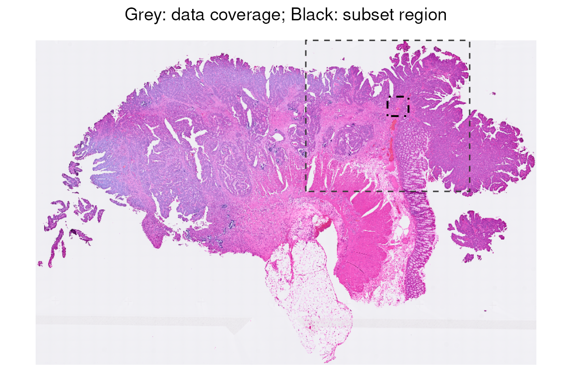
Plot cell polygons overlaid on the H&E image for this subset region (in black box). Here is an overview of the tissue subset that we will use throughout the workflow.
vhdsub$polygon <- 1
p0 <- plotImage(vhdsub, bbox = unlist(getBoxRange(vhdsub)))

p1 <- plotSpatialFeature(vhdsub, bbox = unlist(getBoxRange(vhdsub)),
                         features = "polygon", alpha = 0.1, fill = NA, color = "white",
                         colGeometryName = "updatecellSeg", image_id = "hires") +
  no_legend

(p0 + ggtitle("H&E region") |
  p1 + ggtitle("Overlayed with cell boundaries")) &
  center_title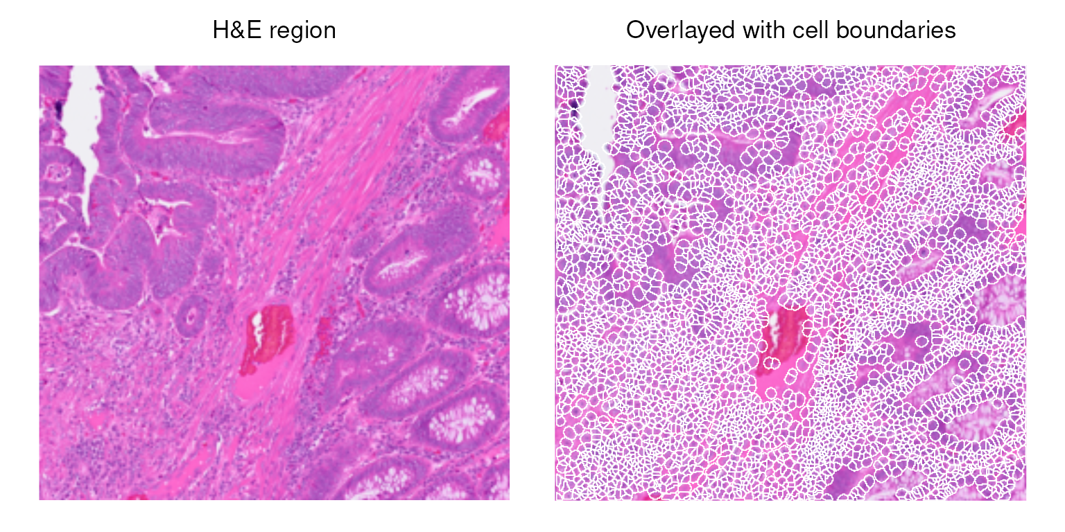
Which cells pass quality check?
Compute cell-level QC metrics using scuttle.
# Visualize library size to the polygons
sub <- list(mt = grep("^MT-", rownames(vhdsub)))
vhdsub <- addPerCellQCMetrics(vhdsub, subsets = sub)
vhdsub$log_sum <- log1p(vhdsub$sum)

CD <- colData(vhdsub) %>% as.data.frame()
head(CD %>% select(Barcode, sum, log_sum, subsets_mt_percent))
#>                  Barcode  sum  log_sum subsets_mt_percent
#> 84452 cellid_000084452-1  139 4.941642           3.597122
#> 84464 cellid_000084464-1  553 6.317165           2.169982
#> 84472 cellid_000084472-1 1218 7.105786           2.298851
#> 84476 cellid_000084476-1 1004 6.912743           4.681275
#> 84504 cellid_000084504-1  835 6.728629           5.029940
#> 84560 cellid_000084560-1  436 6.079933           2.981651
Here is an overview of cells colored by their log library size and mitochondrial percentage.
p0 <- plotSpatialFeature(vhdsub, features = "log_sum",
                   colGeometryName = "updatecellSeg") +
  ggtitle("log library size")

p1 <- plotSpatialFeature(vhdsub, features = "subsets_mt_percent",
                         colGeometryName = "updatecellSeg") +
  ggtitle("% mitochondrial")

(p0 | p1) &
  gradient_theme &
  scale_fill_gradientn(colors = pals::jet())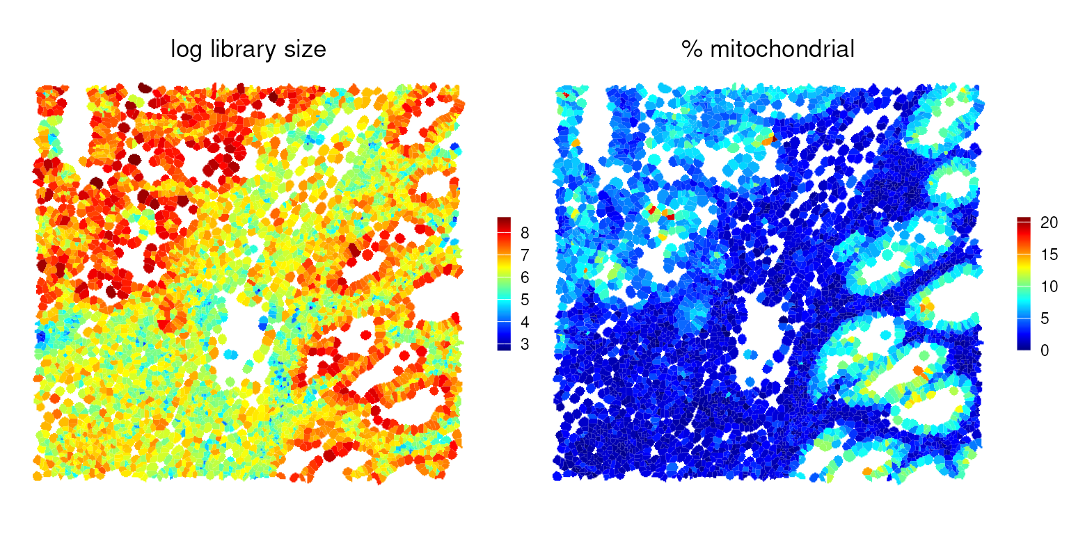
SpotSweeper
SpotSweeper identifies outliers based on low log-library size, a low number of uniquely detected features, or a high mitochondrial fraction relative to the surrounding neighborhood:
vhdsub <- localOutliers(vhdsub, metric="sum", direction="lower", log=TRUE)
vhdsub <- localOutliers(vhdsub, metric="detected", direction="lower", log=TRUE)
vhdsub <- localOutliers(vhdsub, metric="subsets_mt_percent", direction="higher", log=TRUE)
vhdsub$discard <-
    vhdsub$sum_outliers |
    vhdsub$detected_outliers |
    vhdsub$subsets_mt_percent_outliers
# tabulate number of cells retained vs. removed by any criterion
table(vhdsub$discard)
#>
#> FALSE  TRUE
#>  4406    13
We can visualize the local outliers identified by
SpotSweeper in a spatial context. However, they are
difficult to discern, as only a small number of relatively small cells
are flagged as outliers.
common_args_qc <- list(fill = NA, color = "grey90", linewidth = 0.1,
                    colGeometryName = "updatecellSeg")

p0 <- exec(plotSpatialFeature,
           vhdsub, features = "sum_outliers", !!!common_args_qc) +
  ggtitle("low_lib_size")

p1 <- exec(plotSpatialFeature,
           vhdsub, features = "detected_outliers", !!!common_args_qc) +
  ggtitle("low_n_features")

p2 <- exec(plotSpatialFeature,
           vhdsub, features = "discard", !!!common_args_qc) +
  ggtitle("discard")

p0 + p1 + p2 +
  plot_layout(nrow=1, guides="collect") &
  thin_discrete_legend & center_title &
  scale_fill_manual("discard", values=c("white", "red"))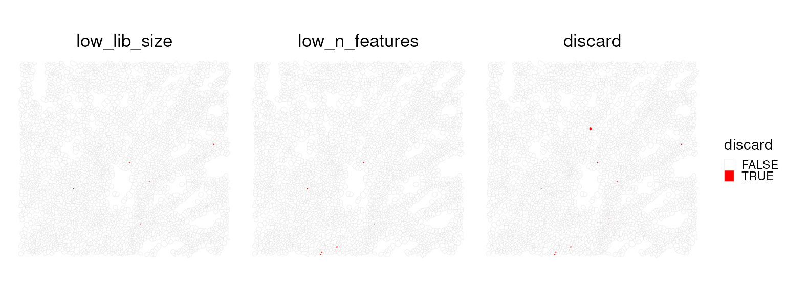
What type of cells do we have in this region?
Load reference
This Visium HD dataset includes matched scRNA-seq data from the same
tissue, which helps avoid tissue-specific and batch effects that often
complicate label transfer. The Level1 column contains
broad, interpretable cell populations that are well suited for
deconvolution and downstream interpretation. We use these labels to map
likely cell identities onto the Visium HD cells.
First, we load the data from the OSTA.data package.
## SCE ref
id <- "Chromium_HumanColon_Oliveira"

## Download the data for OSTA.data and unzip the files
pa <- OSTA.data_load(id)
dir.create(td2 <- tempfile())
unzip(pa, exdir=td2)

# read into 'SingleCellExperiment'
fs <- list.files(td2, full.names=TRUE)
h5 <- grep("h5$", fs, value=TRUE)
sce <- read10xCounts(h5, col.names=TRUE)

# add cell metadata
csv <- grep("csv$", fs, value=TRUE)
cd <- read.csv(csv, row.names=1)
colData(sce)[names(cd)] <- cd[colnames(sce), ]

# use gene symbols as feature names
rownames(sce) <- make.unique(rowData(sce)$Symbol)

# exclude cells deemed to be of low-quality
sce <- sce[, sce$QCFilter == "Keep"]
We will use this single-cell dataset as a reference. It contains cell
annotations at two resolutions. First, let’s inspect the labels in
Level1.
# tabulate subpopulations
table(sce$Level1)
#>
#>               B cells           Endothelial            Fibroblast
#>                 33611                  7969                 28653
#> Intestinal Epithelial               Myeloid              Neuronal
#>                 22763                 25105                  4199
#>         Smooth Muscle               T cells                 Tumor
#>                 43308                 29272                 65626
Spaces can make manipulating data tricky sometimes, so let’s replace them with underscores.
sce$Level1 <- gsub(" ", "_", sce$Level1)For speed, we down-sample to at most 1,000 cells per reference class. This preserves diversity within each class while keeping memory use and runtime manageable.
RCTD - Robust decomposition of cell type mixtures in spatial transcriptomics
There are many approaches for transferring labels from single-cell
data to spatial data. Here, we use spacexr
(i.e., RCTD) because it performs competitively in public
benchmarks (Sang-Aram et al. (2024); Li
et al. (2023); Gaspard-Boulinc et al. (2025)), explicitly models mixed
signals, and assigns each spatial unit a clear classification as either
a singlet or one of several doublet types.
RCTD was originally developed for spot-based platforms
such as 10x Visium, where each spot captures RNA from multiple cells.
The method models the observed counts in each spot as a mixture of
reference cell-type expression profiles and uses a likelihood-based
framework to estimate non-negative weights for each candidate cell type.
It then compares a singlet model with a doublet model to determine
whether the counts are best explained by one or two cell types. In
addition, RCTD learns scale factors to account for
differences in platform characteristics and total RNA content,
facilitating robust label transfer across technologies (Cable et al. (2022)).
In our setting, we apply RCTD at cellular resolution
using segmented Visium HD data. Although each unit is intended to
represent a single cell, there are cases where the measured counts may
reflect contributions from multiple cell types. This can arise from
partial-volume effects at cell boundaries, segmentation errors, densely
packed regions, or local diffusion of transcripts. Running
RCTD in doublet mode remains useful in this context, as it
can flag such cases and provide a principled estimate of the most likely
composition. In practice, we expect most units to be classified as
singlets, with a smaller fraction of doublets that warrant closer
inspection or additional filtering.
Because running RCTD is computationally intensive, we
load a precomputed result for this workflow.
# data("rctd_result_level1.RData", package = "EuroBioC2025_OSTA_Workshop")
load(here::here("data/rctd_result_level1.RData"))
!!! Do not run this in the workshop, as it will take 30 mins.
# ## Perform initial preprocessing of the visiumHD and single cell reference data
# rctd_data <- createRctd(spatial_experiment = vhdsub,              # Our visium HD data
#                         reference_experiment = sce[, down_sample],# Down-sampled single cell reference
#                         cell_type_col="Level1",                   # We will use the Level1 resolution of cell types.
#                         UMI_min = 0)                              # To make things easier, we won't filter away cells that RCTD thinks are poor quality.
#
# ## Perform the deconvolution.
# rctd_result_level1 <- runRctd(rctd_data, max_cores = 4, rctd_mode = "doublet")
# # save(rctd_result_level1, file = here::here("data/rctd_result_level1.RData"))
Note: RCTD includes internal quality control steps, so
we first check whether any cells were filtered out before running the
deconvolution.
dim(vhdsub)
#> [1] 18132  4419
dim(rctd_result_level1)
#> [1]    9 4418
setdiff(colnames(vhdsub), colnames(rctd_result_level1))
#> [1] "91874"
vhdsub$discard[colnames(vhdsub) == "91874"]
#> [1] TRUE
vhdsub$sum_outliers[colnames(vhdsub) == "91874"]
#> [1] TRUE
vhdsub$sum[colnames(vhdsub) == "91874"]
#> [1] 14
head(sort(vhdsub$sum))
#> [1] 14 18 19 19 22 23
The spot labels are stored in colData() as
spot_class. This provides a quick quality check: observing
a majority of singlet classifications at cellular resolution is expected
and supports the validity of the H&E-guided segmentation.
table(rctd_result_level1$spot_class)
#>
#>            reject           singlet   doublet_certain doublet_uncertain
#>               115              2660              1347               296
We then synchronize the deconvolution labels back into our
vhdsub SpatialFeatureExperiment object by
matching cell IDs, ensuring that all components remain properly
aligned.
# Subset to RCTD filtered object for convenience
vhdsub <- vhdsub[, colnames(vhdsub)]

# Here we use match to ensure that we match the cell IDs
vhdsub$cellTypeClass <- rctd_result_level1$spot_class[
  match(colnames(vhdsub),colnames(rctd_result_level1))]
vhdsub$cellType <- rctd_result_level1$first_type[
  match(colnames(vhdsub), colnames(rctd_result_level1))]

# Double check that the numbers of the cell types is consistent
table(vhdsub$cellType)
#>
#>               B_cells           Endothelial            Fibroblast
#>                   497                   460                  1010
#> Intestinal_Epithelial               Myeloid              Neuronal
#>                   529                   547                    11
#>         Smooth_Muscle               T_cells                 Tumor
#>                    90                   262                  1012
We can visualize the spatial distribution of singlets, doublets, or
the cell types assigned by RCTD.
p0 <- plotSpatialFeature(vhdsub, features = "cellTypeClass",
                   colGeometryName = "updatecellSeg") +
  scale_fill_manual(values = unname(pals::okabe()))
p1 <- plotSpatialFeature(vhdsub, features = "cellType",
                   colGeometryName = "updatecellSeg") +
  scale_fill_manual(values = unname(pals::trubetskoy()))

(p0 | p1) & thin_discrete_legend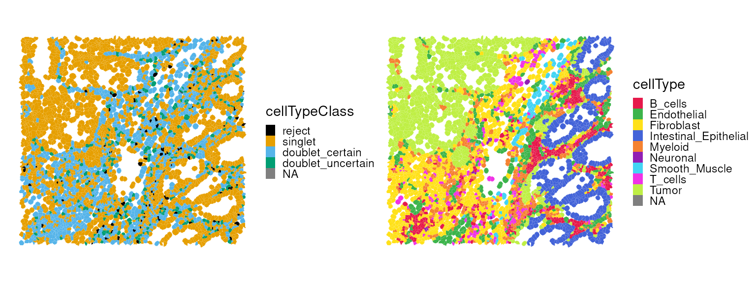
Previously, we identified a cell that was flagged as a local outlier
by SpotSweeper. We can now examine its properties in more
detail.
table(vhdsub$subsets_mt_percent_outliers == TRUE)
#>
#> FALSE  TRUE
#>  4418     1
vhdsub$cellType[vhdsub$subsets_mt_percent_outliers == TRUE]
#> [1] "T_cells"
vhdsub$cellTypeClass[vhdsub$subsets_mt_percent_outliers == TRUE]
#> [1] doublet_uncertain
#> Levels: reject singlet doublet_certain doublet_uncertain
Filter out low-quality cells from the
SpatialFeatureExperiment object prior to performing spatial
clustering.
vhdsub <- vhdsub[, !vhdsub$discard]
dim(vhdsub)
#> [1] 18132  4406
Spatial domain identification
First, we identify highly variable genes (HVGs) within the target region. Note that spatially variable genes (SVGs) could be used as an alternative.
vhdsub <- logNormCounts(vhdsub)
dec <- modelGeneVar(vhdsub)
hvg <- getTopHVGs(dec, n=3e3)
Banksy
Banksy utilizes a pair of spatial kernels to capture gene expression variation, followed by dimension reduction and graph-based clustering to identify spatial domains.
# restrict to selected features
tmp <- vhdsub[hvg, ]

# compute spatially aware 'Banksy' PCs
set.seed(1000)
tmp <- computeBanksy(tmp,
                     assay_name = "logcounts",
                     coord_names = c("array_row", "array_col"),
                     k_geom = 8)   # consider first order neighbors
tmp <- runBanksyPCA(tmp,
                    lambda = 0.2, # use little spatial information,
                    npcs = 20)
reducedDim(vhdsub, "PCA") <- reducedDim(tmp)

set.seed(1000)
tmp <- Banksy::clusterBanksy(tmp, lambda = 0.2, npcs = 20, resolution = 0.8)
vhdsub$Banksy <- tmp$clust_M0_lam0.2_k50_res0.8

table(vhdsub$Banksy)
#>
#>    1    2    3    4    5    6    7
#> 1287  844  700  560  471  281  263
We can now visualize the clustering results spatially.
plotSpatialFeature(vhdsub, features = "Banksy",
                   colGeometryName = "updatecellSeg") +
  scale_fill_manual(values = unname(pals::kelly())) +
  thin_discrete_legend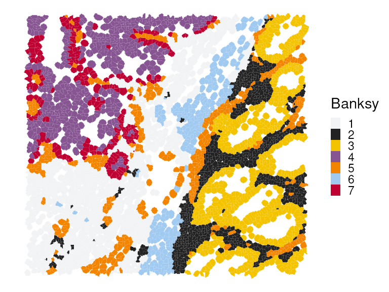
Next, we perform differential gene expression (DGE) analysis to identify marker genes for each cluster. We also compute the cluster-wise mean expression of selected markers.
# differential gene expression analysis
mgs <- findMarkers(vhdsub, groups = vhdsub$Banksy, direction = "up")
# select for a few markers per cluster
top <- lapply(mgs, \(df) rownames(df)[df$Top <= 2])
top <- unique(unlist(top))
# average expression by clusters
pbs <- aggregateAcrossCells(vhdsub,
    ids = vhdsub$Banksy, subset.row = top,
    use.assay.type = "logcounts", statistics = "mean")
Marker genes for each cluster can be visualized using a heatmap.:
# visualize averages z-scaled across clusters
exec(pheatmap,
    mat = t(assay(pbs)), scale = "column", breaks = seq(-2, 2, length = 101),
    !!!common_args_heatmap)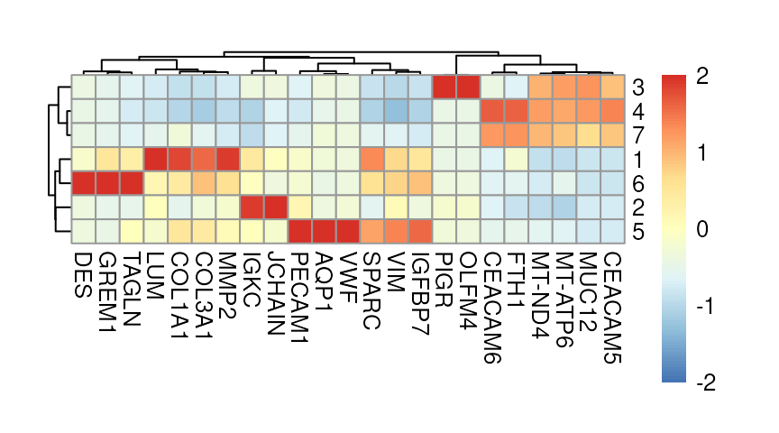
Here, we highlight selected marker genes from clusters 1, 3, and 6, and also visualize their expression patterns in a spatial context:
p0 <- plotSpatialFeature(vhdsub, features = "MMP2",
                   colGeometryName = "updatecellSeg") + ggtitle("MMP2")

p1 <- plotSpatialFeature(vhdsub, features = "PIGR",
                         colGeometryName = "updatecellSeg") + ggtitle("PIGR")

p2 <- plotSpatialFeature(vhdsub, features = "DES",
                         colGeometryName = "updatecellSeg") + ggtitle("DES")

(p0 | p1 | p2) &
  gradient_theme &
  scale_fill_gradientn(colors = rev(hcl.colors(9, "Rocket")))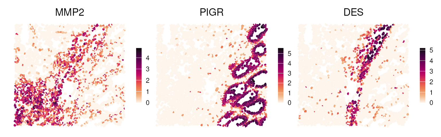
Concordance of deconvolution & clustering
Here, we juxtapose the spatial plots of the deconvolution and clustering results.
p0 <- plotSpatialFeature(vhdsub, features = "cellType",
                         colGeometryName = "updatecellSeg") +
  scale_fill_manual(values = unname(pals::trubetskoy())) +
  ggtitle("RCTD")

p1 <- plotSpatialFeature(vhdsub, features = "Banksy",
                   colGeometryName = "updatecellSeg") +
  scale_fill_manual(values = unname(pals::kelly())) +
  ggtitle("Banksy")

p0 + p1 +
  plot_layout(nrow=1) &
  center_title & thin_discrete_legend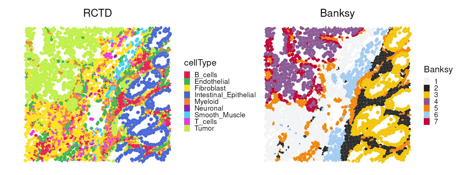
We observe that Banksy delineates tissue boundaries
effectively, while RCTD provides direct biological insight
into the underlying clusters. The concordance between the two methods
can be visualized using a heatmap:
fq <- prop.table(table(vhdsub$Banksy, vhdsub$cellType), 1)
exec(pheatmap, fq, !!!common_args_heatmap)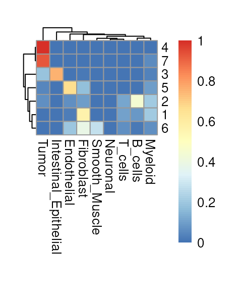
Feature-set signatures
Individual biomarkers identified in the DGE step may or may not have direct phenotypic relevance. Instead, we can quantify gene sets that are known to orchestrate biological functions or pathways, such as metabolic activity, cell cycle progression, and cell death, at the single-cell level.
MSigDB provides a programmatic interface to the Molecular Signatures Database (MSigDB) (Subramanian et al. (2005)), one of the largest curated collections of molecular signatures and pathways. We begin by retrieving the human Hallmark gene set collection.
# retrieve & simplify hallmark gene sets from 'MSigDB'
db <- msigdbr(species="Homo sapiens", collection="H")
gs <- split(db$ensembl_gene, db$gs_name)
names(gs) <- tolower(gsub("HALLMARK_", "", names(gs)))
Next, we score these gene sets using AUCell (Aibar et al. (2017)), a rank-based approach that (i) ranks genes for each cell and (ii) computes the area under the recovery curve (AUC) for each gene set.
# realize (sparse) gene expression matrix
mtx <- as(logcounts(vhdsub), "dgCMatrix")
# use ensembl identifiers as rownames
rownames(mtx) <- rowData(vhdsub)$ID
# filter for genes represented in panel
.gs <- lapply(gs, intersect, rownames(mtx))
# keep only those with at least 5 genes
.gs <- .gs[sapply(.gs, length) >= 5]
# build per-cell gene rankings
rnk <- AUCell_buildRankings(mtx, plotStats=FALSE, verbose=FALSE)
# calculate AUC for each gene set in each cell
auc <- AUCell_calcAUC(geneSets=.gs, rankings=rnk, verbose=FALSE)
A heatmap can be used to examine which signatures are highly expressed in each cell type. To diversify the visualization, we instead summarize the top two signatures per cell type and display their scaled average enrichment scores in a waterfall plot.
# aggregate AUC values by cellType
mu <- aggregateAcrossCells(auc, ids=vhdsub$cellType,
                           use.assay.type="AUC", statistics="mean")
mu_row_scaled <- rowScale(mu)
top_mu <- getTopSigDF(mu_row_scaled, top_n = 2)

plotDivergentBar(top_mu)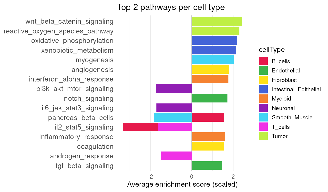
p53 is a well-known pathway involved in tumor cell growth (Vogelstein et al. (2000)), and its enrichment score can be visualized spatially.
# add results as cell metadata
colData(vhdsub)[rownames(auc)] <- t(assay(auc))
plotSpatialFeature(vhdsub, feature = "p53_pathway",
                   colGeometryName = "updatecellSeg") + gradient_theme +
  ggtitle("p53 Pathway")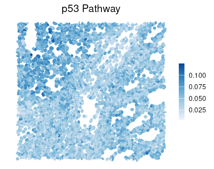
Shape statistics
Because cell segmentation polygons are available for each cell, we can derive a wide range of shape metrics (Gunz et al. (2025)). sosta was originally developed to analyze multi-cellular anatomical structures using polygons that outline regions of cells; here, we extend its use to investigate the geometry of individual cells.
# get cell segmentations
cellpo <- colGeometry(vhdsub, "updatecellSeg")
cellpo$cellType <- vhdsub$cellType
# get shape metrics
shme <- totalShapeMetrics(cellpo)
shme[1:3, 1:3]
#>                   cellpo1     cellpo2     cellpo3
#> Area         1067.8050000 854.2350000 2558.400000
#> Compactness     0.7758488   0.4156039    0.521787
#> Eccentricity    0.8027392   0.5734005    0.740000
Here we can check the relationship between shape metrics in the first two principal components (PCs):
tshme <- t(shme) |> as.data.frame()
autoplot(
  prcomp(tshme, scale. = TRUE),
  data = cellpo,
  color = "cellType",
  size = 0.8, alpha = 0.8,
  loadings.colour = "blue",
  loadings.label = TRUE,
  loadings.label.size = 5,
  loadings.label.colour = "black") +
  scale_color_manual(values=unname(pals::trubetskoy())) +
  theme_classic() + enlarge_legend_dot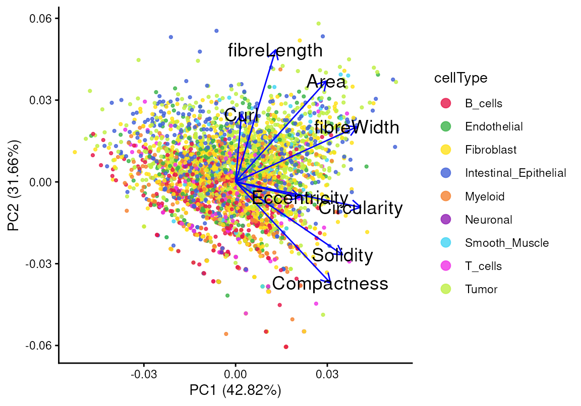
The first principal component (PC1) explains 42.82% of the
variability in the shape statistics, and the second principal component
(PC2) captures 31.66%. The angle between two shape metrics reflects
their degree of similarity, while the length of a loading indicates the
strength of a given metric. For example, the loadings of
fibreLength and Compactness are nearly
perpendicular, indicating a weak or negative correlation between them,
which is consistent with their relationship in the scatter plot. We can
also color the points by the log gene expression of PIGR, a
common epithelial marker, as shown previously. Cells with high
PIGR expression tend to exhibit longer
fibreLength, with no obvious association with
compactness.
tshme$logPIGR <- logcounts(vhdsub)["PIGR", ]
ggplot(tshme, aes(x = fibreLength, y = Compactness)) +
  geom_point(aes(color = logPIGR), alpha = 0.8) +
  scale_color_viridis_c(option = "rocket", direction = -1) +
  geom_density2d() +
  geom_smooth(method='loess', formula= y~x) +
  stat_cor(method = "pearson", label.x.npc = "center", label.y.npc = "top") +
  theme_classic() + gradient_theme + ggtitle("PIGR")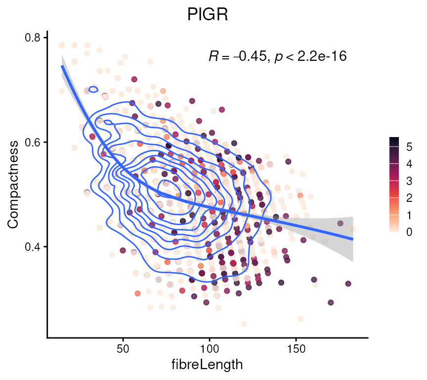
Next, we can summarize the shape statistics per cell type. We check
the differences in fibreLength and Compactness
across cell types.
tshme |>
  cbind(cellType = vhdsub$cellType) |>
  pivot_longer(cols = -cellType, names_to = "metrics", values_to = "val") |>
  filter(metrics %in% c("Compactness", "fibreLength")) |>
  ggplot(aes(x = cellType, y = val, fill = cellType)) +
  geom_violin() +
  geom_boxplot(aes(fill = NULL), width = 0.3) +
  facet_wrap(~metrics, scales = "free") +
  scale_fill_manual(values = unname(pals::trubetskoy())) +
  theme_classic() +
  theme(axis.text.x = element_text(angle = 45, hjust = 1)) +
  guides(fill = "none")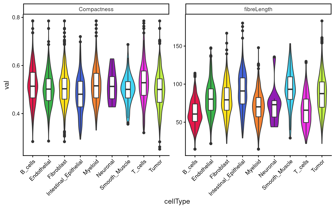
We observe more uniform distribution in Compactness,
while more variability in fibreLength across cell
types.
We can also view these shape metrics, such as
fibreLength, spatially:
colData(vhdsub)[names(tshme)] <- tshme

plotSpatialFeature(vhdsub, features = "fibreLength",
                   colGeometryName = "updatecellSeg") +
  scale_fill_gradientn(colors = c("#3B3EA8", "#278EC8", "orange", "yellow")) +
  gradient_theme + ggtitle("fibreLength")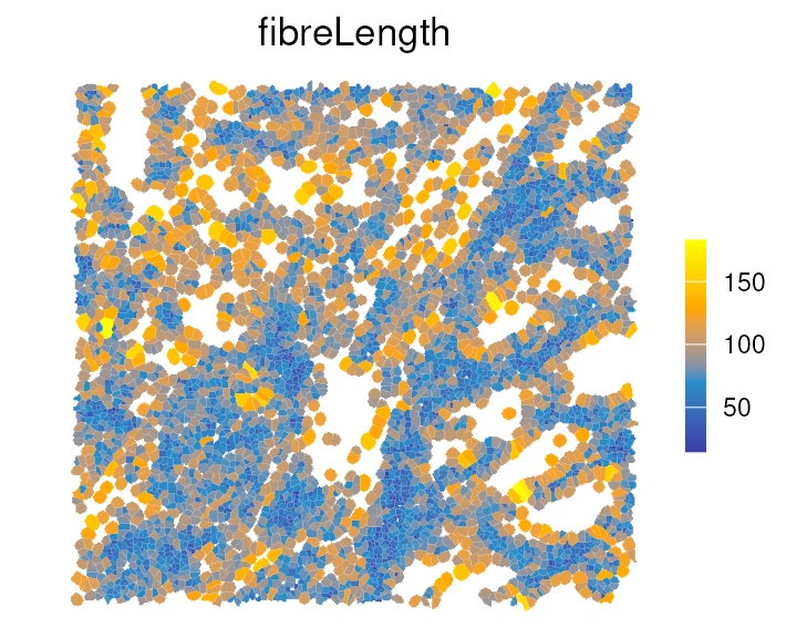
For example, immune cells have shorter fibreLength
compared to tumor and stromal cells, which is also shown in the boxplot
above.
Interrogating the spatial arrangement of our cells.
What makes spatial transcriptomics more powerful than scRNA-seq is its integration with spatial statistics. Measures of spatial association are commonly classified as either global or local.
Global spatial association
Next, we quantify spatial proximity between annotated cell types. The
getPairwise() function from the spicyR
package computes the K-cross function for all pairs of cell types,
summarizing whether cells of type A tend to occur within a distance
r of cells of type B more frequently than expected under
spatial randomness. Here, we use a radius of 200 units (~50 microns) to
capture immediate neighborhood effects, corresponding to roughly one to
two cell diameters.
crossK = getPairwise(vhdsub,
                     r = 200,
                     cellType = "cellType",
                     imageID = "sample_id",
                     spatialCoords = c("pxl_col_in_fullres",
                                       "pxl_row_in_fullres"))
We can visualize these relationships using
imageCrossPlot(), which displays spatial enrichment and
avoidance across all cell-type pairs. This overview is useful for
scanning for strong interactions before exploring specific pairs in more
detail. To aid interpretation, note the sign of the values: those above
zero indicate spatial attraction at radius r (more
co-occurrence than expected), while values below zero indicate spatial
repulsion.
imageCrossPlot(crossK, limits = c(-400,400)) + gradient_theme +
  ggtitle("Spatial association") +
  theme(axis.line = element_blank(), axis.ticks = element_blank())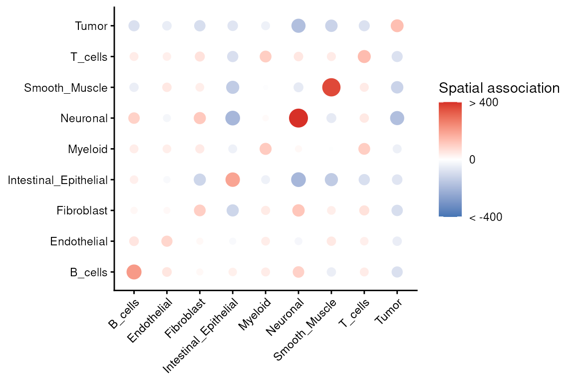
We can revisit the spatial composition of cell types annotated by
RCTD to build intuition for these statistics. This helps
confirm that strong pairwise signals are visible in the tissue image and
are not driven by a handful of cells.
Local indicator of spatial association - LISA
Visium HD cell-level data can be modeled as a point pattern process (Emons et al. (2025)). In contrast to the global average measures described above, local indicators of spatial association (LISA) quantify the local contribution of each cell (Anselin (1995)). First, we construct a plotting data frame containing the LISA Ripley’s K values for tumor cells only.
df <- .speToDf(vhdsub)
pp <- .dfToppp(df, marks="cellType")

# subset to only Tumor cells
ppSub <- subset(pp, marks %in% "Tumor")

# calculate LISA K curves
resLocal <- localK(ppSub, verbose=FALSE)

# code adapted from
# https://robinsonlabuzh.github.io/pasta/01-imaging-univar-ppSOD.html
df <- resLocal |>
  as.data.frame() |>
  pivot_longer(cols = starts_with("iso"), names_to="curve")

sel <- df |>
  filter(r > 700.5630 & r < 702.4388) |>
  mutate(sel=value) |>
  select(curve, sel)

plt_df <- left_join(df, sel)
head(plt_df)
#> # A tibble: 6 × 5
#>       r  theo curve   value      sel
#>   <dbl> <dbl> <chr>   <dbl>    <dbl>
#> 1     0     0 iso0001     0 4642842.
#> 2     0     0 iso0002     0 4042413.
#> 3     0     0 iso0003     0 4173456.
#> 4     0     0 iso0004     0 4113007.
#> 5     0     0 iso0005     0 2766533.
#> 6     0     0 iso0006     0 4535711.
Plot the LISA Ripley’s K value for each tumor cell, colored by its value at a radius of 700 pixels. Curves above the gray line that represents complete spatial randomness (CSR) indicate highly clustered tumor cells in the right spatial plot.
p <- ggplot(plt_df, aes(r, value, group=curve, col=sel)) +
  geom_line() +
  geom_line(aes(y=theo), linetype=2, col="darkgray") +
  geom_vline(xintercept=700) +
  scale_color_viridis_c(option = "mako") +
  xlab("Radius (r)") +
  scale_y_continuous(breaks = c(0, 2e6, 4e6), labels = c("0", "2", "4"),
                     name = bquote("Relationship value x"~10^6)) +
  theme_classic() +
  theme(legend.position="none",
        axis.title = element_text(size=14),
        panel.grid.major = element_line(colour = "grey90", linetype = 2))

q <- ggplot(sel %>% cbind(data.frame(x = ppSub$x, y = ppSub$y)),
            aes(x, y, col=sel)) +
  coord_equal(expand=FALSE) +
  geom_point(size=1) +
  scale_color_viridis_c(option = "mako") +
  theme_classic() + theme(legend.position = "none")

p | q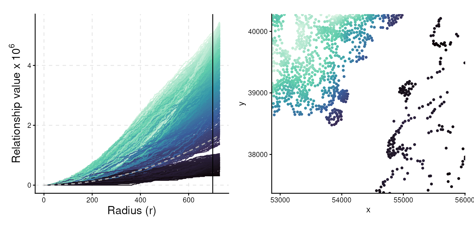
Localisation in context
While pairwise proximity statistics provide a sensible first step,
they can sometimes be misleading because they ignore the broader tissue
context. For example, the K-cross function from spicyR
indicates whether two cell types are found close together more often
than expected under a random distribution, but it does not address
conditional questions. Biologists, however, are often interested in
questions such as:
“Are there certain immune cells that cluster more tightly with tumor cells, after accounting for the fact that immune cells generally do not cluster with tumors?”
This is where Kontextual, from the Statial
package, becomes useful. Kontextual goes beyond pairwise
enrichment by constructing a contextual null model. Rather than
comparing two cell types against a fully random distribution, it
compares the observed association to what would be expected given the
local mixture of neighboring cell types. In practice, this means that
Kontextual tests whether a particular association is
stronger or weaker than expected given the surrounding cellular
environment.
For this demonstration, we define an immune context composed of T
cells, myeloid cells, and B cells. Kontextual then
evaluates whether, within this immune backdrop, specific pairs (for
example, myeloid–tumor) show evidence of additional attraction or
repulsion at a chosen spatial scale. The method is flexible: any
grouping of interest can be defined as a “parent” or context, allowing
conditional relationships of a population to be interrogated relative to
that context.
## Create a vector saying which cells are in the immune context
immune <- c("T_cells", "Myeloid", "B_cells")

## Define the parents we want to use as contexts
parentDf <- parentCombinations(
  all = unique(vhdsub$cellType),
  immune = immune)

## Run Kontextual with radius of 20
resultsKontextual <- Kontextual(
  cells = vhdsub,
  parentDf = parentDf,
  imageID = "sample_id",
  cellType = "cellType",
  spatialCoords = c("pxl_col_in_fullres", "pxl_row_in_fullres"),
  r = 200
)
Let’s visualize the results.
plotKontext <- resultsKontextual |>
  ggplot(aes(original, kontextual, label = test)) +
  geom_point() +
  geom_hline(yintercept = 0) +
  geom_vline(xintercept = 0) +
  theme_classic()

ggplotly(plotKontext)
We can then inspect radius-dependent curves (for example, Myeloid cells around Tumor cells) to determine the spatial scales at which the effect emerges, which is often informative for processes such as invasion fronts or peritumoral niches.
curves <- kontextCurve(
  cells = vhdsub, rs = seq(20, 500, 50),
  from = "Tumor", to = "Myeloid", parent = immune, se = TRUE,
  image = "sample01", cellType = "cellType", imageID = "sample_id"
)

p <- kontextPlot(curves) + theme_classic() +
  scale_color_manual(labels = c("Kontextual", "L-Function"),
                     values = c("#00BE70", "darkblue")) +
  scale_fill_manual(values = c("lightgreen", "lightblue")) +
  theme(panel.grid.major = element_line(colour = "grey90", linetype = 2),
        legend.position = "top",
        legend.text = element_text(size = 13),
        axis.title = element_text(size = 14))
p@layers$geom_hline$aes_params$colour <- "black" # update dashed line color
p$layers[["geom_ribbon"]]$show.legend <- FALSE   # remove geom ribbon box
p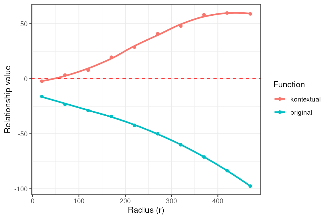
At a global level, the negative L-function values suggest that
Myeloid and Tumor cells are spatially segregated. However, the positive
Kontextual values indicate that Myeloid cells cluster more
strongly with Tumor cells than would be expected given their immune
context (i.e., relative to other immune cells).
To aid interpretation, we can also re-plot the spatial map with the immune context shown in gray and the two focal cell types highlighted in color. This helps link the statistical findings to tangible spatial patterns within the tissue.
ct_interest <- c("Myeloid", "Tumor")
vhdsub$myetu <- ifelse(!(vhdsub$cellType %in% ct_interest),
                       "Other", vhdsub$cellType)
vhdsub$myetu <- factor(vhdsub$myetu, levels = c(ct_interest, "Other"))
plotSpatialFeature(vhdsub, features = "myetu",
                   colGeometryName = "updatecellSeg") +
  scale_fill_manual(name   = "cellType",
                    values = c("Myeloid" = "#f58231", "Tumor" = "#bfef45",
                               "Other" = "grey90")) +
  thin_discrete_legend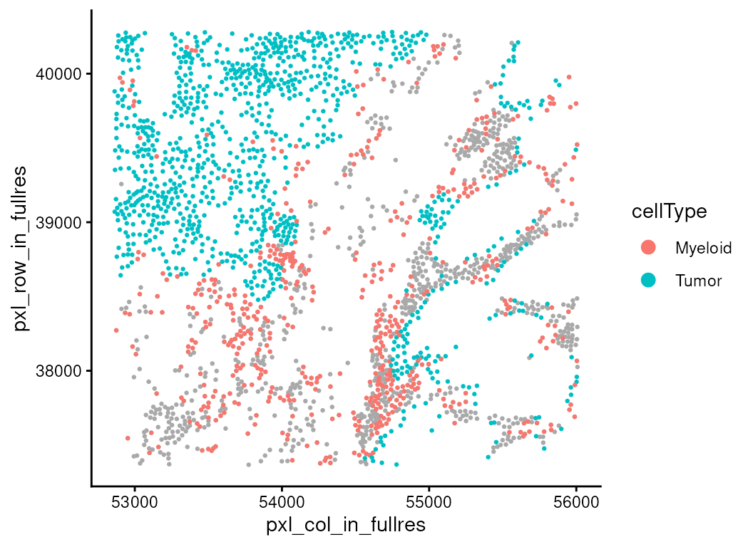
Identifying expression changes associated with cell localisation
Spatial proximity tells us where different cell types are relative to one another, but an equally important question is what happens to those cells when they are in close contact. Proximity alone does not guarantee functional interaction. To uncover biological relevance, we need to test whether changes in the microenvironment are associated with measurable shifts in gene expression within a given cell type.
This is the motivation behind spatioMark, part of the
Statial package. The idea is simple:
take a target population (for example, Myeloid cells),
quantify its local environment (how many Tumor cells, T cells, Fibroblasts, etc. are nearby within a certain radius),
and ask whether the transcriptomes of the target cells vary with that environment.
In practice, spatioMark first computes local abundances
of each cell type around every cell, giving each cell a numerical
“neighborhood profile.” These covariates then feed into a gene-wise
regression model. For each gene expressed in the target population,
spatioMark fits a generalized linear model. As we have
count data in this case, we leverage functionality in the
edgeR package to model the data as negative binomial. The
coefficients tell us whether gene expression increases or decreases as
the abundance of a chosen neighbor rises.
Abundance
First, we need to quantify the abundance of each cell type around each cell.
vhdsub <- getAbundances(vhdsub,
  r = 200,
  cellType = "cellType",
  imageID = "sample_id"
)
Next, we focus on whether Myeloid cells show distinct expression patterns when they are located close to Tumor cells.
stateChanges <- calcStateChanges(
  cells = vhdsub,
  type = "abundances",
  from = "Myeloid",
  to = "Tumor",
  test = "nb",
  imageID = "sample_id"
)

stateChanges |> head(20)
#>     imageID primaryCellType otherCellType  marker        coef       tval
#> 1  sample01         Myeloid         Tumor   IGHG3 -0.26986581 -18.176051
#> 2  sample01         Myeloid         Tumor    SPP1  0.11458632  13.630583
#> 3  sample01         Myeloid         Tumor   MMP11  0.05409721   7.351737
#> 4  sample01         Myeloid         Tumor   MMP12  0.05773036   6.921257
#> 5  sample01         Myeloid         Tumor   IL1RN  0.04404694   5.943101
#> 6  sample01         Myeloid         Tumor    IGHD -0.02380578  -5.875567
#> 7  sample01         Myeloid         Tumor    CTSB  0.03596732   5.741341
#> 8  sample01         Myeloid         Tumor   GREM1 -0.05300939  -5.724902
#> 9  sample01         Myeloid         Tumor  MT-CO1  0.03483848   5.647737
#> 10 sample01         Myeloid         Tumor   WNT5A  0.03899693   5.637293
#> 11 sample01         Myeloid         Tumor    PYGB  0.04308331   5.471111
#> 12 sample01         Myeloid         Tumor     MGP -0.04772709  -5.118931
#> 13 sample01         Myeloid         Tumor   APOC1  0.03665541   5.096505
#> 14 sample01         Myeloid         Tumor CEACAM6  0.03919565   5.091371
#> 15 sample01         Myeloid         Tumor    PLAU  0.03954202   4.999526
#> 16 sample01         Myeloid         Tumor    IGKC -0.07047815  -4.912809
#> 17 sample01         Myeloid         Tumor  MT-CO3  0.03117035   4.901309
#> 18 sample01         Myeloid         Tumor   KRT23  0.02789161   4.848393
#> 19 sample01         Myeloid         Tumor     DES -0.04838446  -4.805449
#> 20 sample01         Myeloid         Tumor   IGHG1 -0.05020400  -4.782172
#>            pval          fdr
#> 1  3.994157e-74 3.392237e-70
#> 2  1.317335e-42 5.594065e-39
#> 3  9.782363e-14 2.769387e-10
#> 4  2.238265e-12 4.752396e-09
#> 5  1.398403e-09 2.375328e-06
#> 6  2.106995e-09 2.982451e-06
#> 7  4.696492e-09 5.493550e-06
#> 8  5.174661e-09 5.493550e-06
#> 9  8.128685e-09 7.335579e-06
#> 10 8.637206e-09 7.335579e-06
#> 11 2.236116e-08 1.726485e-05
#> 12 1.536358e-07 1.078256e-04
#> 13 1.729906e-07 1.078256e-04
#> 14 1.777415e-07 1.078256e-04
#> 15 2.873572e-07 1.627016e-04
#> 16 4.489043e-07 2.378050e-04
#> 17 4.760020e-07 2.378050e-04
#> 18 6.223286e-07 2.936354e-04
#> 19 7.720243e-07 3.450949e-04
#> 20 8.670557e-07 3.681952e-04
The previous output is a ranked list of genes, highlighting markers
that change as Myeloid cells are near Tumor cells. One of the top genes
on this list is SPP1 which is known to be expressed in
tumor-associated macrophages. A positive coefficient of SPP1
suggests higher expression of SPP1 in Myeloid cells when they
are in areas of high tumour density. We can visualize this relationship
using the plotStateChanges() function.
p <- plotStateChanges(
  cells = vhdsub,
  image = "sample01",
  type = "abundances",
  from = "Myeloid",
  to = "Tumor",
  marker = "SPP1",
  imageID = "sample_id",
  size = 1,
  shape = 19,
  interactive = FALSE,
  method = "lm"
)

p[[1]] + theme_void() +
  theme(legend.key.width = grid::unit(0.5, "lines"),
        legend.key.height = grid::unit(1, "lines")) + facet_null() +
ggtitle("Cell Points: Myeloid, Cell Density: Tumor") + center_title 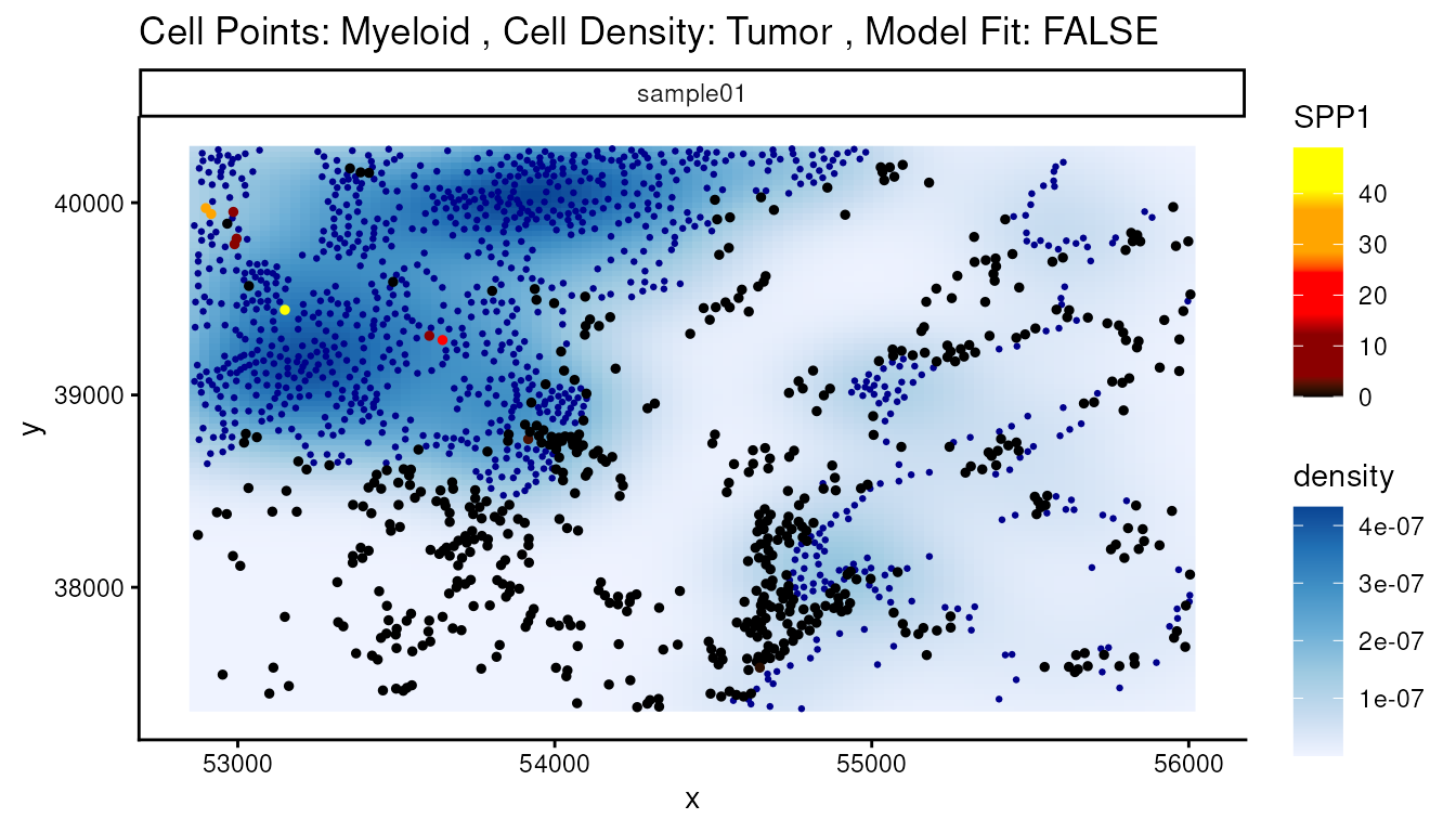
Contamination
However, some genes should not be expressed in macrophages, such as CEACAM6, and are therefore likely the result of lateral spillover or transcript diffusion.
sce[, down_sample] |>
  join_features(features = "CEACAM6", shape = "wide") |>
  mutate(logCEACAM6 = log1p(CEACAM6)) |>
  ggplot(aes(x = Level1, y = logCEACAM6, fill = Level1)) +
  geom_boxplot() +
  scale_fill_manual(values = unname(pals::trubetskoy())) +
  theme_classic() + ylab("CEACAM6 log expression") +
  theme(axis.text.x = element_text(angle = 45, hjust = 1),
        legend.position = "none") +
  thin_discrete_legend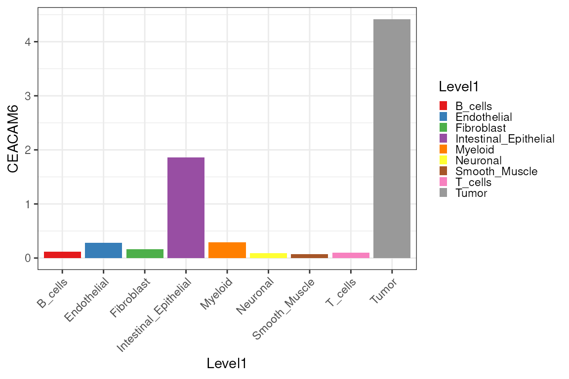
Because we already computed RCTD weights, we can
mitigate contamination by adding deconvolution-derived components as
covariates to our models. By storing the RCTD cell-type
weight matrix into reducedDim(vhdsub, "RCTD"), we can pass
"RCTD" to the contamination argument of
calcStateChanges(). spatioMark will use these
estimates of contamination in its modelling to hopefully remove false
positives like CEACAM6 while preserving genuine
relationships.
contam <- assay(rctd_result_level1, 1) |>
  t() |>
  as.matrix() |>
  as.data.frame()

reducedDim(vhdsub, "RCTD") <- contam[match(colnames(vhdsub), rownames(contam)),]
After correction, the false discovery rate of CEACAM6 is no longer significant at a threshold of 0.05. The rank of this gene falls from 14 to 173, while other macrophage-relevant top genes, such as SPP1, keep their high rankings and remain contamination-invariant.
stateChangesCon <- calcStateChanges(
  cells = vhdsub,
  type = "abundances",
  from = "Myeloid",
  to = "Tumor",
  test = "nb",
  imageID = "sample_id",
  contamination = "RCTD"
)

stateChangesCon |> filter(marker == "CEACAM6")
#>    imageID primaryCellType otherCellType  marker      coef     tval        pval
#> 1 sample01         Myeloid         Tumor CEACAM6 0.0225659 2.376978 0.008727561
#>         fdr
#> 1 0.4283528
Next, we can visualize the change of ranking of CEACAM6 after decontamination, among the top 20 marker genes as Myeloid cells get near Tumor cells.
plotRankChange(target_gene = "CEACAM6", n = 20, stateChanges, stateChangesCon)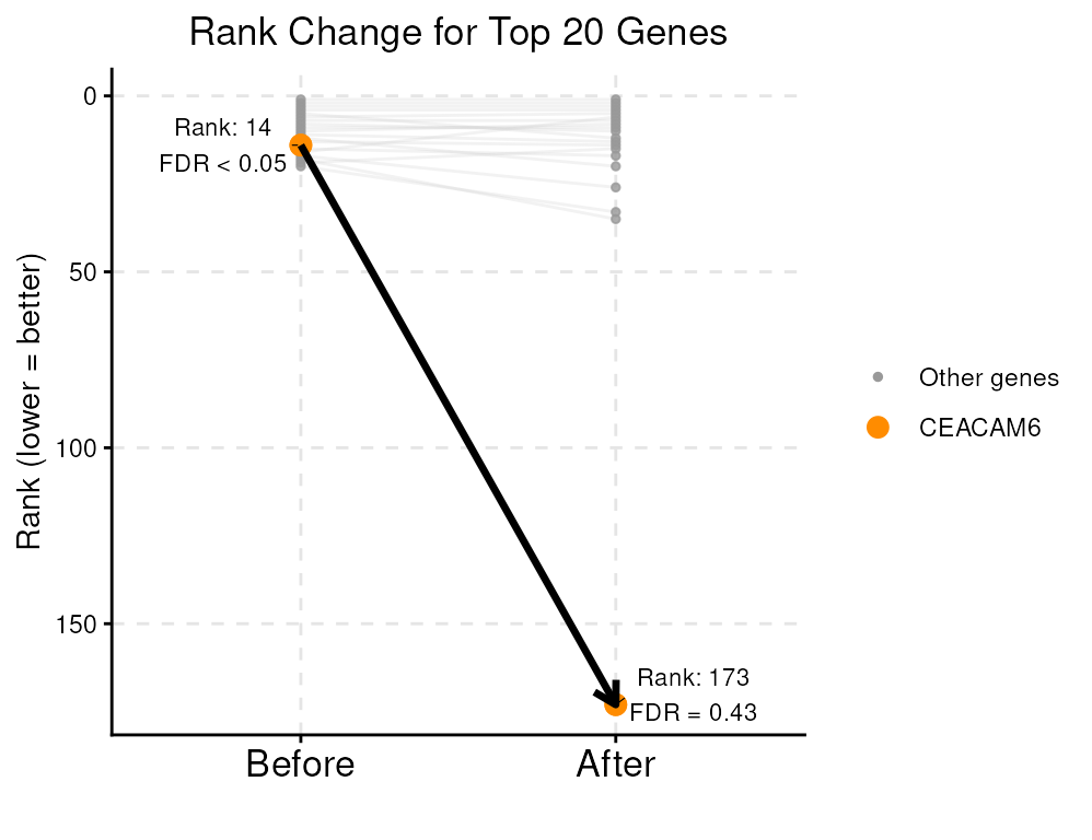
So far, we have analyzed one CRC sample from patient P2. In fact, Oliveira et al. (2025) includes multiple patients in this Visium HD public dataset, spanning different disease conditions (healthy vs. cancer). To apply spatial statistics to assess cell-type colocalization across multiple conditions, you can refer to the Multi-sample chapters of the OSTA book: a. Differential spatial patterns, b. Differential colocalization, c. Structure-based analysis
Extension
You can try using a finer resolution of cell type classified by
RCTD.
Or you can try using a different deconvolution algorithm.
set.seed(1000)
vhd2 <- vhdsub
colnames(spatialCoords(vhd2)) <- c("x", "y")
sce2 <-sce[, down_sample]
counts(vhd2) <- as(counts(vhd2), "sparseMatrix")
counts(sce2) <- as(counts(sce2), "sparseMatrix")
CARD_obj <- CARD_deconvolution(
    spe = vhd2,
    sce = sce2,
    sc_count = NULL,
    sc_meta = NULL,
    spatial_count = NULL,
    spatial_location = NULL,
    ct_varname = "Level2",
    ct_select = NULL,       # decon with all sce$Annogrp cell types
    sample_varname = NULL,  # use all sce as one ref sample
    mincountgene = 0,
    mincountspot = 0
)

# a matrix/data.frame of probabilities per cell (rows) × cell types (cols)
P <- CARD_obj$Proportion_CARD[colnames(vhdsub), ]

# cell type with the largest probability in each row
vhdsub$cellType2 <- colnames(P)[max.col(P, ties.method = "first")]

reducedDim(vhdsub, "CARD") <- as.data.frame(P)